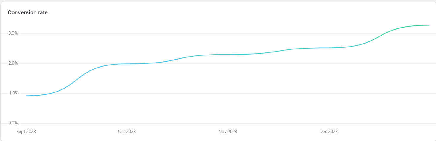

The Webpage was developed using Shopify. Although customer return rate is very high , conversion rate and time spent on website was very low, The conversion rate for Amoret was 0.7% compared to the average 2-5% for an ecommerce website.
Therefore, the aim of the project was to find out
Why the conversion rate was low
Develop and Deploy solutions to improve conversion rate and time spent on the website
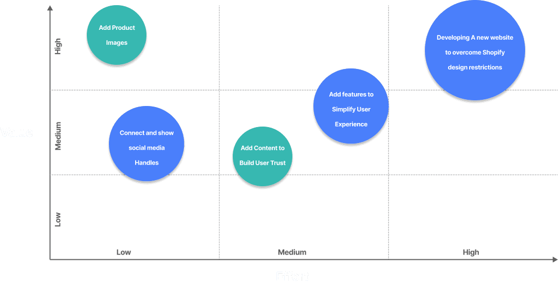
Since the problem is already defined , i.e Increasing Conversion rate and session duration, The Design process focused on the following Phases.
Desk Research
Website Analysis
Development
Testing
Website Design , User Trust
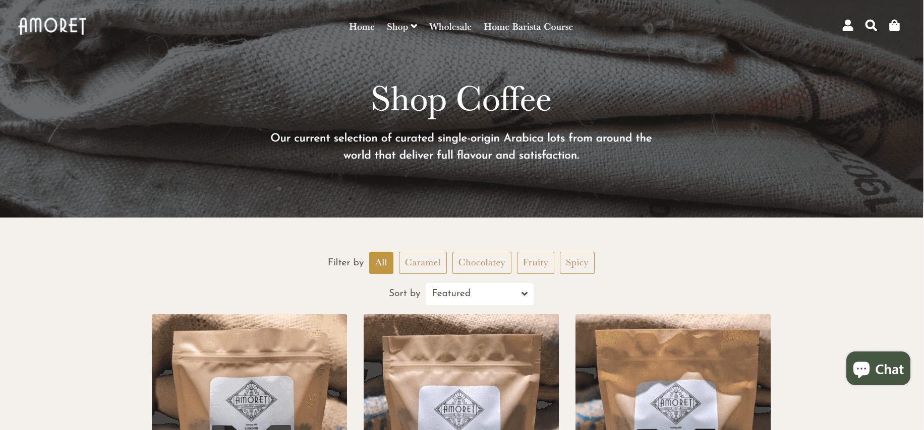
The website was designed as a portal to solely buy their coffee and thus contained a single page with just their products and how to find their shop , There was no information about the shop and what makes them different from other coffee shops. This results in decreased user trust and willingness to buy products. The User interface did not contain any pictures to grab the user's attention. Research shows that User Interface and Colors can play a big role in getting users to click and explore.

Navigation
The navigation for Amoret Coffee showed a hamburger menu for the desktop. This would hide information regarding what possible actions could be taken by the user and would discourage users from exploring the webpage further

Complex Flavor Profiles
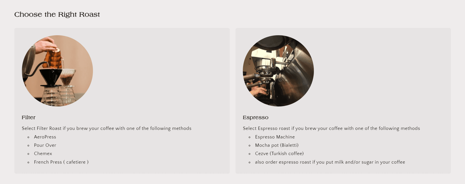
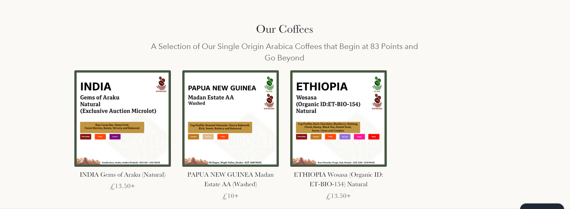
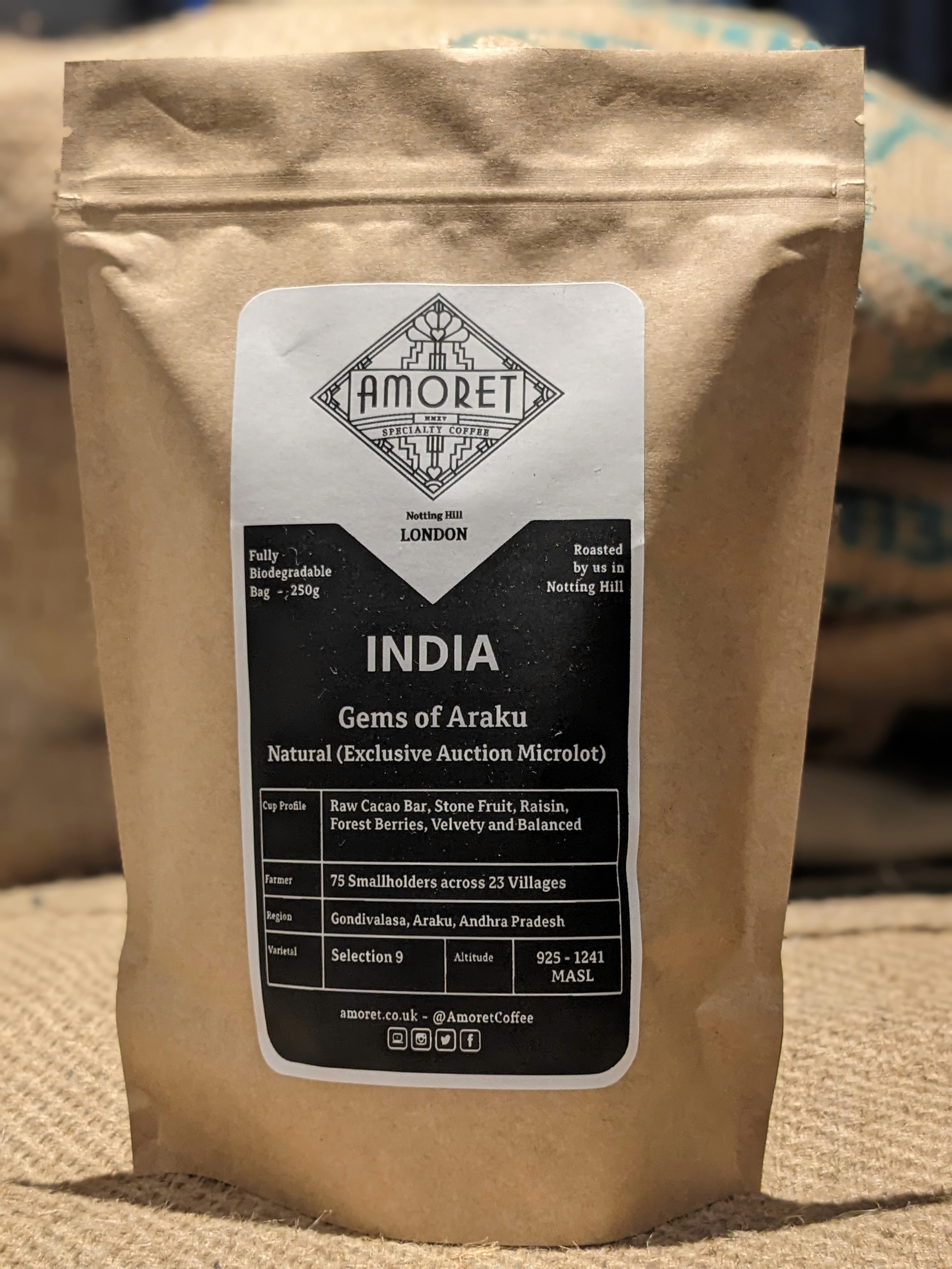
Each coffee has a multitude of flavor profiles which are carefully roasted and developed. The website did not take this into account and users had to click on each product to check the coffee's flavor profiles, the users could alternatively squint and try to see the flavor profiles listed on the infographic pictures of each product.

Amoret used Shopify to create their website and uses it extensively to track orders, receive payments , ship orders and SEO. Although Shopify is sufficient for the aforementioned tasks, their website builder is restrictive and has many constraints, It doesn't nearly offer the same freedom as compared to other website builders. For this project , only features supported by Shopify's website builder could be built.
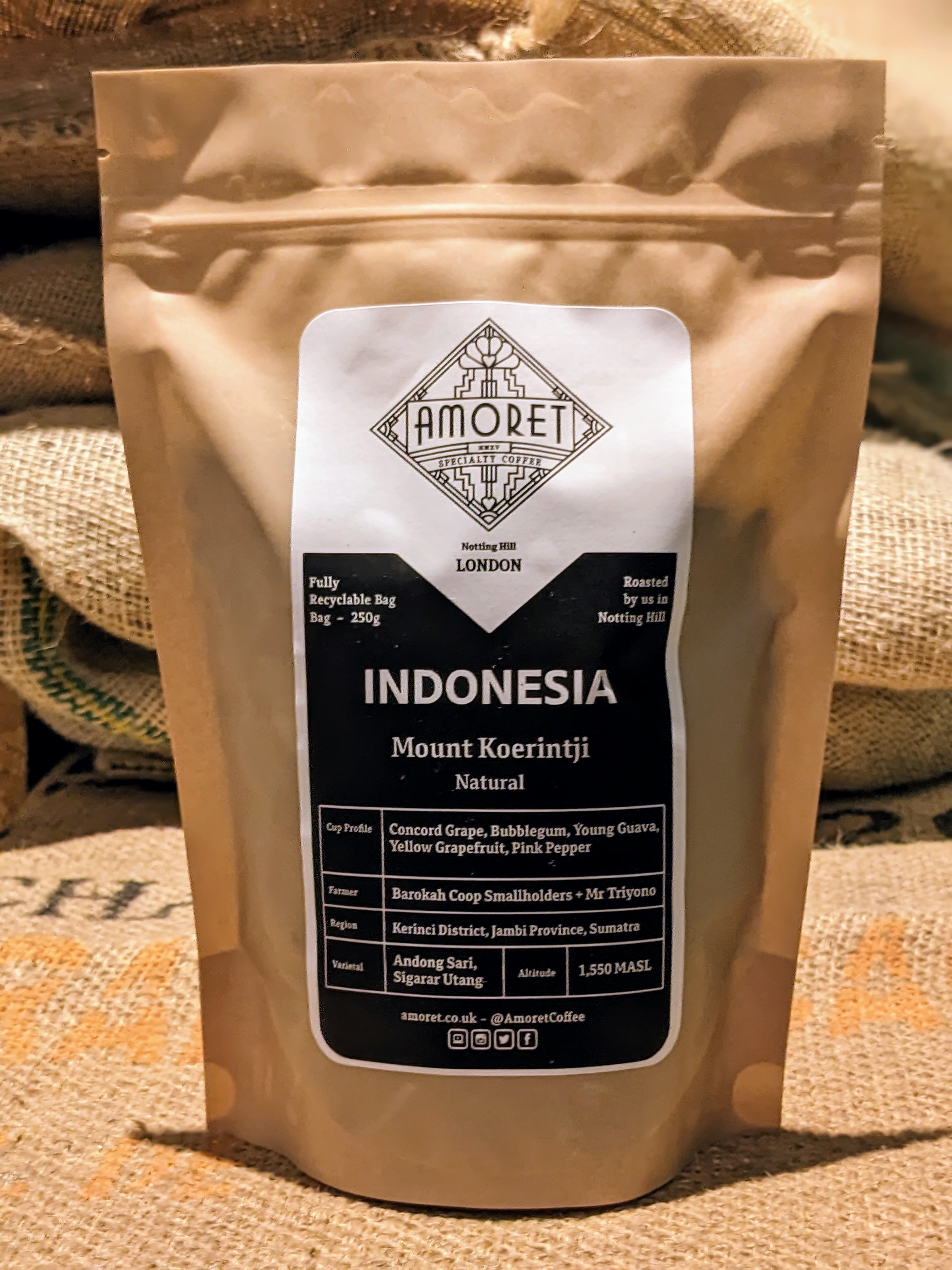
Since there were no product images available , Images of each coffee had to be taken via a mobile phone and edited to match the cozy vibe of the coffee shop. These images were then uploaded and added to the website.
It is also important that the images of the different coffee are consistent to build user trust. Therefore a detailed guide was created to recreate the images for new Coffee


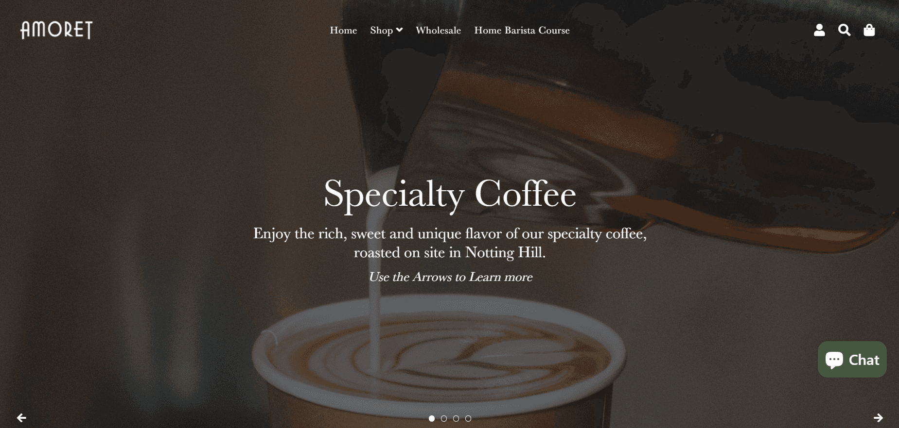
A good Landing Page can have a big impact of the user's initial impressions of the page, it also captures the user's attention and gives them a reason to continue exploring. Therefore a full width banner slideshow was added under the navigation bar , ensuring that the navigation bar remains transparent. A dark overlay was put over the slideshow to make the accompanying text readable
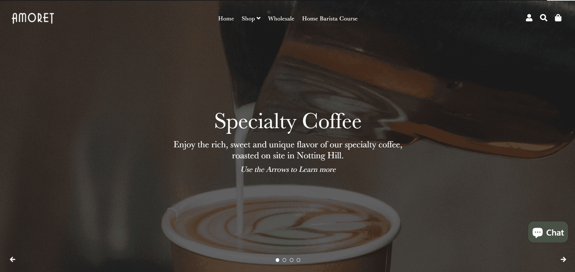
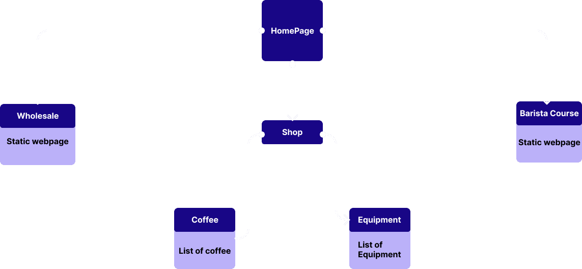
The Information Architecture of the Menu was simplified and added to the Topbar which is transparent when there is a picture in the background and solid as the user scrolls. The Webpage Sitemap was also modified to remove redundant webpages.